|
|
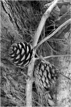
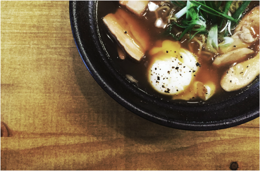
RULE OF THIRDSLEFT: Pinecone Wall, July 2013
RIGHT: The Good Bowl, August 2015 Rule of Thirds helps to divide the photo into 3 by 3 sections to help create photos that are subjective instead of objective. For these images, I used the Rule of Thirds to help compliment the main subject with the background. For the image on the left, the acorn is complimented by the roughness rugged look of the branch and the tree trunk to give the image a feeling of nature. The subject in the image on the right is complimented by the fine finish of the wood to give it a more cultural element to the subject (bowl of noodles). |

|
|
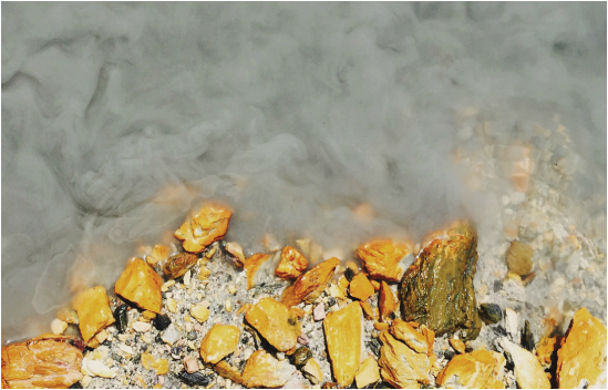
BALANCING ELEMENTSLEFT: Deathly Hallows, August 2015
RIGHT: Claymore Cove, April 2015 This principle refers to the method of harmonizing positive and negative space. I particularly like rocks that are, or have been submerged in water. The reflection of light from the rocks gives an amazing pop of colour that compliments the solidity of the water. In the image on the right, the extreme pop of yellow from the rocks gives a sense of warming elements that balances the empowering neutrality of the greys in the water. In the image on the left, there is also a sense of balance of both warm and cool colours that reflect from both the rocks and the water. |
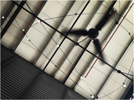
leading linesLEFT: A Top Above, December 2014
RIGHT: Hibernation, December 2014 This composition focuses on the element in the photo where the viewer eyes leads them. In these images, the viewer can get a sense of direction when observing them. In the image on the left, the viewer's attention will lead upwards, while in the image on the right, the viewer's attention will be focused on the bubbles that are lined up on the leaf. |

|

|
SYMMETRY & PATTERNSLEFT: Square Shackles, December 2014
RIGHT: Understatement, December 2014 In these images, I focused more on geometrical patterns. In both images (taken in different perspectives), there is a satisfying repeating rhythm of squares. The image on the left shows a focus on the sewage grills at a pier. The image on the right focuses on the distinct architecture of the building. |

|

|
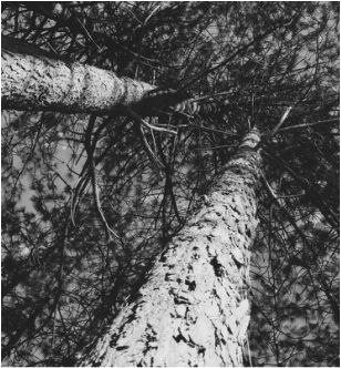
ViewpointLEFT: Poor Wealthy, July 2015
RIGHT: Giants There Be, December 2014 Viewpoint refers to the focus of perspective of the photos taken from a particular site. The images are taken from the viewpoint on the ground. The image on the left, it is supposed to show the cheap, but trending style of which wealthy establishments follow. The image on the right shows the beauty of the mass and size of the tree. |
|
|
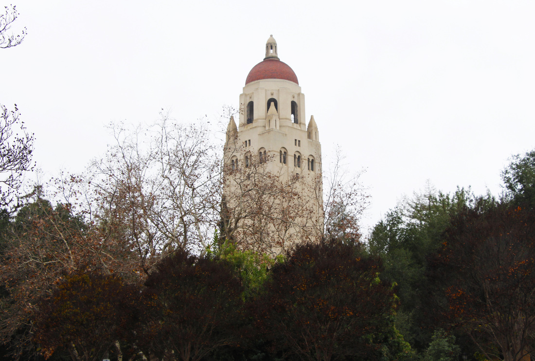
BACKGROUNDLEFT: The Impossible Dream, December 2014
RIGHT: Ignorant History, December 2014 Background refers to the dominant area of the photo of which it helps compliment, and or emphasize the subject without taking away the focus of the subject. The background on the image on the left emphasizesK on the subject (Hoover Tower) that is prevalent beyond the trees. The background on the image on the right however, is complimenting the subject (the partially destroyed arch). |
|

|
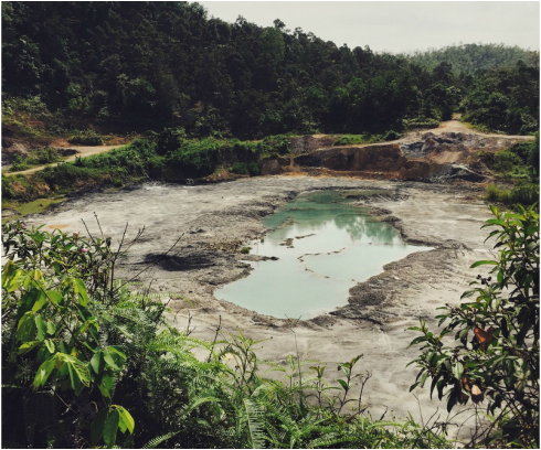
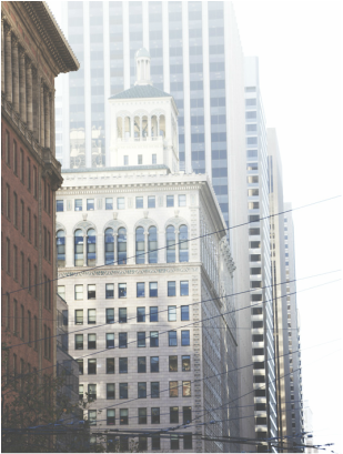
DepthLEFT: Development, April 2015
RIGHT: Concrete Jungle December 2014 Depth may refer to the dimension of the image (foreground, middle ground, background). In the image on the left, we can see that the foreground are the leaves and small plants, the middle ground is the pond, and the background involves the forest and the sky. The image on the right, has the foreground as the red building, the middle ground as more prevalent building, and the background as the skyscraper. |
|
|
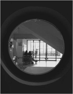
FramingLEFT: Cinema, August 2015
RIGHT: Looking Right Through, August 2015 Framing refers to the borders within the image that helps emphasize or create a subject of focus. The image on the left represents a cinema-like style of bordering (widescreen) with the subject fixed to the centre. The image on the right shows the subject of focus being framed by a circular window. |

|
|

|

|
CroppingLEFT: The Tall One, August 2015
RIGHT: Yellow Lights, August 2015 Cropping refers to the method of creating a different photo by cutting out dominant parts of an original photo. The image on the left is cropped from a picture where the background was the more dominant element of the photo. The image on the right was cropped from a picture that didn't focus on the light bulbs as the subject of the photo. |
|
|
ExperimentationLEFT: One Big Step, August 2015
RIGHT: Prism, August 2015 On the image on the left, I played with the contrast levels to achieve what I thought made the water seemed solid, and the rocks seemed rougher and more textile. On the image on the right, I played with the RGB sliders as well as white balance to achieve transparency in the water, allowing more colour and reflections to appear in the photo. |
